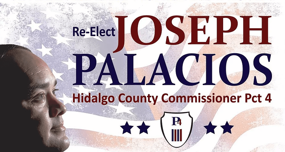
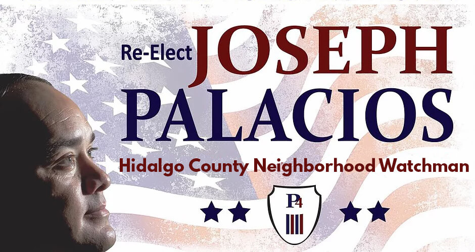
Hidalgo County Commissioner for Pct. 4, Joseph Palacios, is running for re-election and I can’t NOT look at his severely awkward campaigns signs.
In what is one of the worst campaign signs I’ve ever seen, Palacios is in full profile here looking up at his name(?). I get that candidates putting their mug on their signs is a commonly used design, but I have no idea what Palacios’ campaign was going for here other than “full-on creep.”
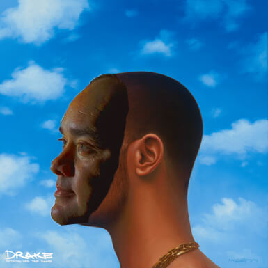
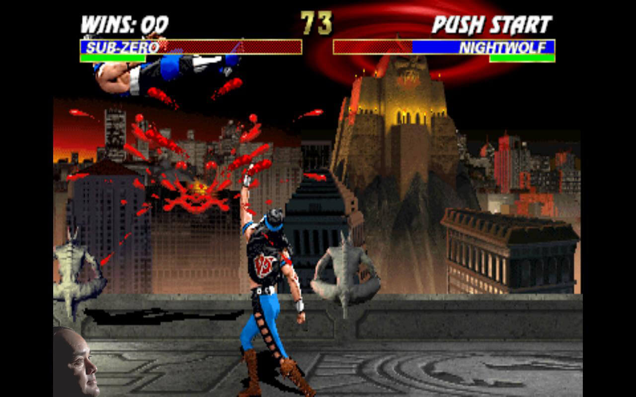
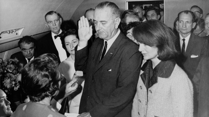
And now here are some terrible photoshops for you to pass along to your friends: (Use zoom for mobile)
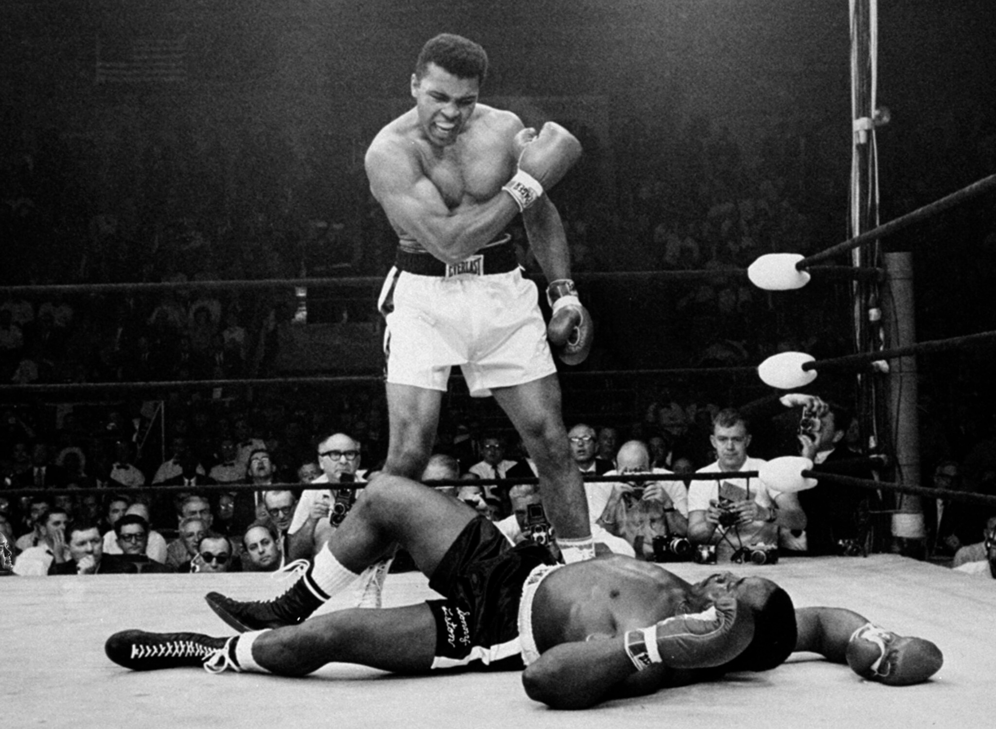

We are currently accepting submissions of your best photoshops at jd@thebenchwire.com
Here’s the face template:
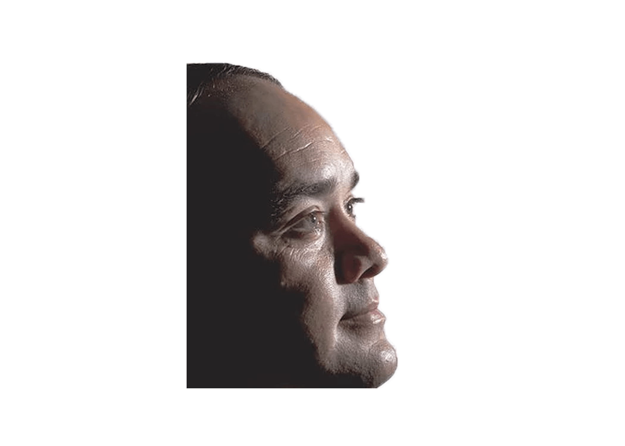
Have at it.

