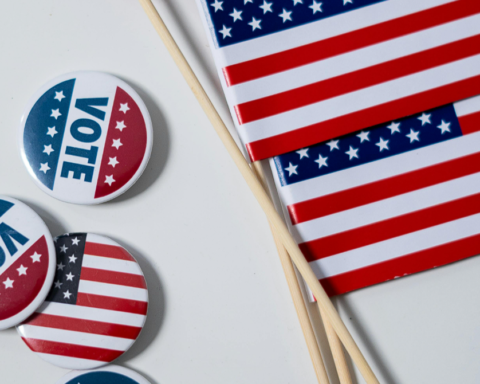
It’s campaign season in McAllen, which means your eyes get to be polluted by all sorts of campaign signs in hopes of attracting you enough to even, you know, actually give a shit vote. Let’s be real: I don’t think anybody on or running for the McAllen city commission is going to give me the time of day to interview them on their policies, so we’re offering up the next best thing!
To help you comb through the madness, we’re rating all seventeen(!) candidates’ campaign signs who are running for the McAllen city commission. To keep things fair, these ratings are based SOLELY on their political signs, not on their politics, policies, etc. All images have been sourced by each candidate’s own Facebook campaign pages.
On to the ratings!
Mayor
Candidate: Othal Brand Jr.
Campaign Sign
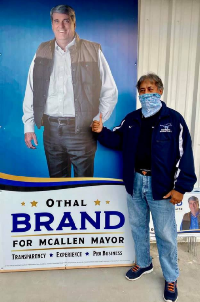
Rating: 5.5/10
The design for his actual campaign logo is solid, symmetrical and the contrast between the dark blue and gold is appealing to the eye. I’ll never understand this latest trend of vertical signs with the candidate’s photo at the top. It’s awkward as shit with no natural cutoff unless you go full body (FORESHADOWING!). Where is Brand going in that outfit, by the way? Too formal for hiking with that long sleeve under that tech vest, too casual for a business meeting. This is straight-up the uniform of every dad from Mexico shopping at the mall. Wear a damn tie, Othal.
—
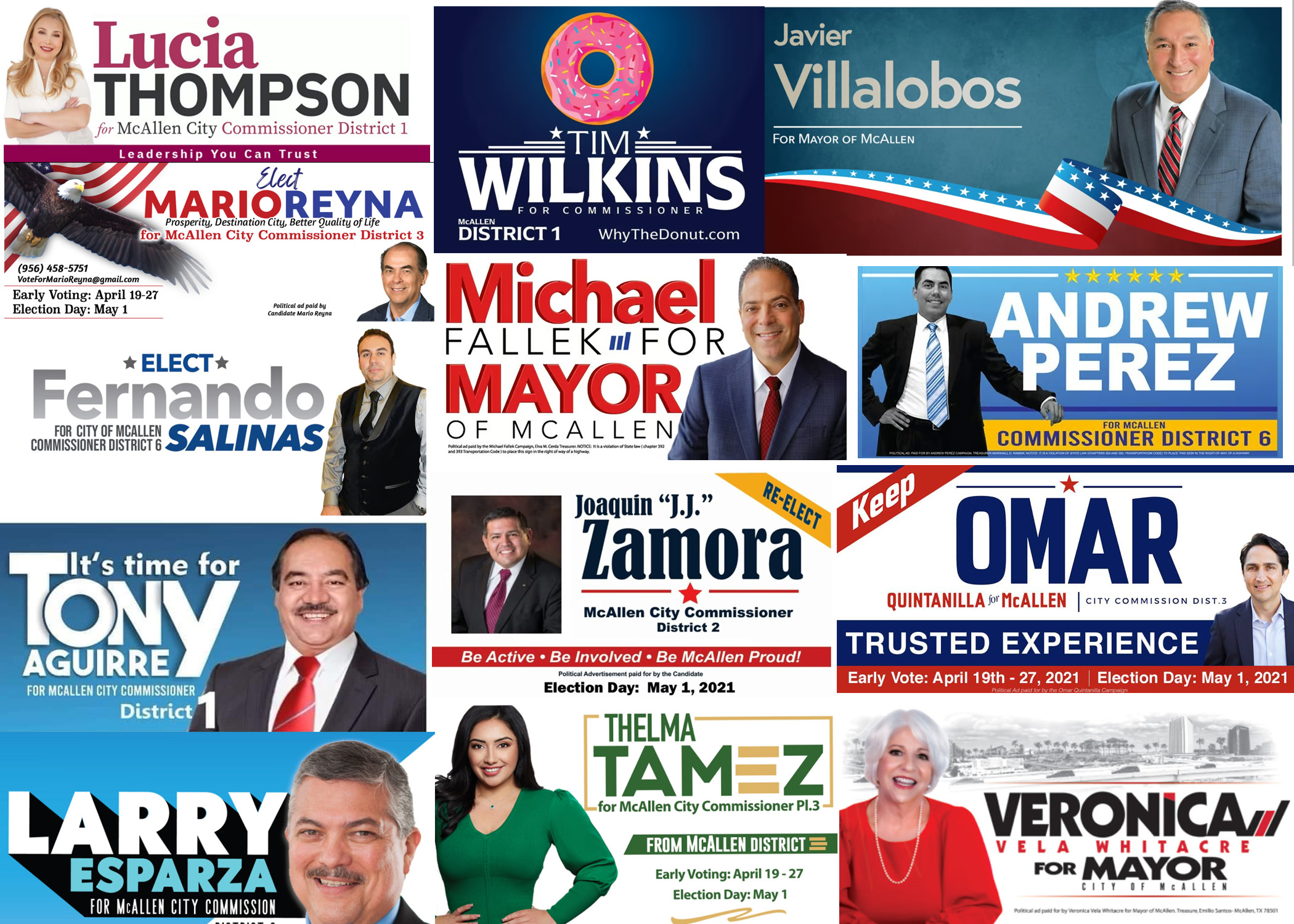
Candidate: Javier Villalobos
Campaign Sign
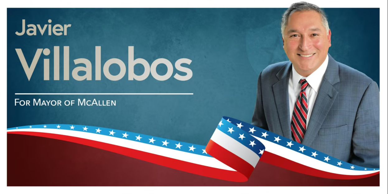
Rating: 3.3/10
Nothing about this sign tells you that it was made by a seasoned graphics designer. The poor color contrast between his name and the background, the “For Mayor” isn’t lined up correctly, the awkward flag divider vector; nothing about this design makes sense. You drive by this sign and there’s absolutely nothing remarkable about a sign with a guy’s name that isn’t even capitalized, where you can barely read what he’s running for. What makes this worse is that he literally used the exact same sign design when he ran for city commissioner.
—
Candidate: Veronica Whitacre
Campaign Sign
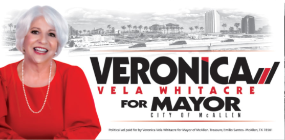
Rating: 6.8/10
Clever campaign logo with good use of alternative styles of fonts, color, and spacing. In theory, the McAllen sketch in the background would be sharp if it wasn’t meant to be seen by cars driving 40 MPH. When I drove by one of these signs, I thought someone had literally erased and smudged the top of her sign. Also, the color scheme makes her silver-white hair look like’s it’s part of McAllen’s “mountainous” landscape. Again, this is a sign you have to really focus on to really take in the design when driving by; just make sure you don’t hit a bicyclist when you do.
—
Candidate: Michael Fallek
Campaign Sign
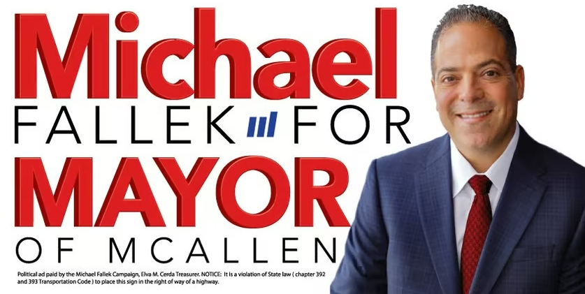
Rating: 6.2/10
Every inch of space was used for this design and hits you with the only point it was making: Michael, Mayor. The alliteration probably went into that decision. My issue with the design is that “Michael” is the only part that’s in sentence case; there’s really no reason for that and throws off the logo’s balance. There’s also nothing particularly unique about the campaign logo; it honestly looks like something you could design on Microsoft Word and Publisher with little effort.
—
Candidate: Dr. Shahid Rashid
Campaign Sign
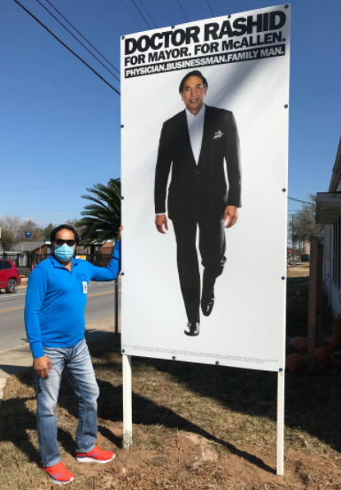
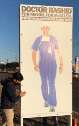
Rating: 2.4/10
Here we have Dr. Rashid, channeling his inner Richard Cortez/Precious in quite possibly the tackiest signs this campaign cycle. Also, if this guy wins, he’ll have to duke it out with another physician mayor to see how many days straight they can work in scrubs. Ughh, just, no.
—
District 1
Candidate: Timothy Wilkins
Campaign Sign
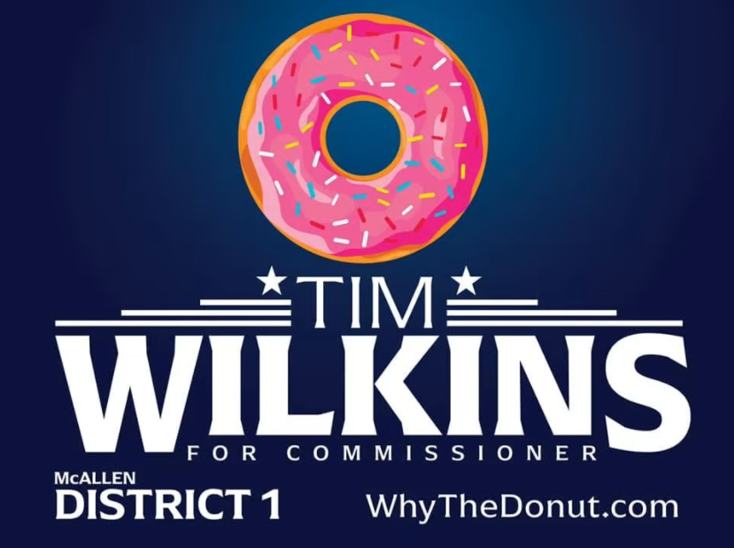
Rating: 7.5/10
The campaign logo is symmetrical with a design that had some thought put into it. Wilkins is known to pull some off-brand campaigning like that one time he made a video campaigning covered in bird shit but his “Why The Donut” campaign is actually a bit clever once you discover its purpose. Now, will people actually look it up or really care that a big donut is on the sign? Probably not. Still, it’s a well-designed sign.
—
Candidate: Lucia “Lucy” Thompson
Campaign Sign
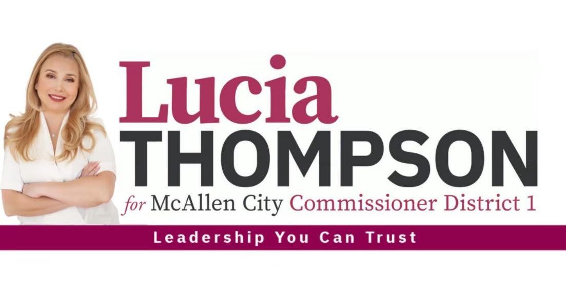
Rating: – 6.6/10
Contrary to Fallek’s sign, the sentence case actually works here with her first name. It directly contrasts her last name in case, color, and font, which tells you the design was curated by someone who actually knew what they were doing. Other than that and a neat Resene cardinal color, the design is still fairly safe compared to the other candidates vying for the same spot.
—
Candidate: Antonio “Tony” Aguirre
Campaign Sign
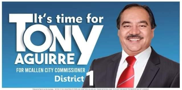
Rating: 7.8/10
Pretty excellent use of space including his campaign slogan into his logo. I mean, you look at the guy and he just fits that phrase so perfectly. His goofy-ass smile tells you that he knows you like that damn slogan, too. I imagine he was probably drunk at some point when he made his decision to run and began shouting “IT’S TIME FOR TONY! IT’S TONY TIME BABY!!!!”
—
District 2
Candidate: Joaquin “J.J.” Zamora
Campaign Sign
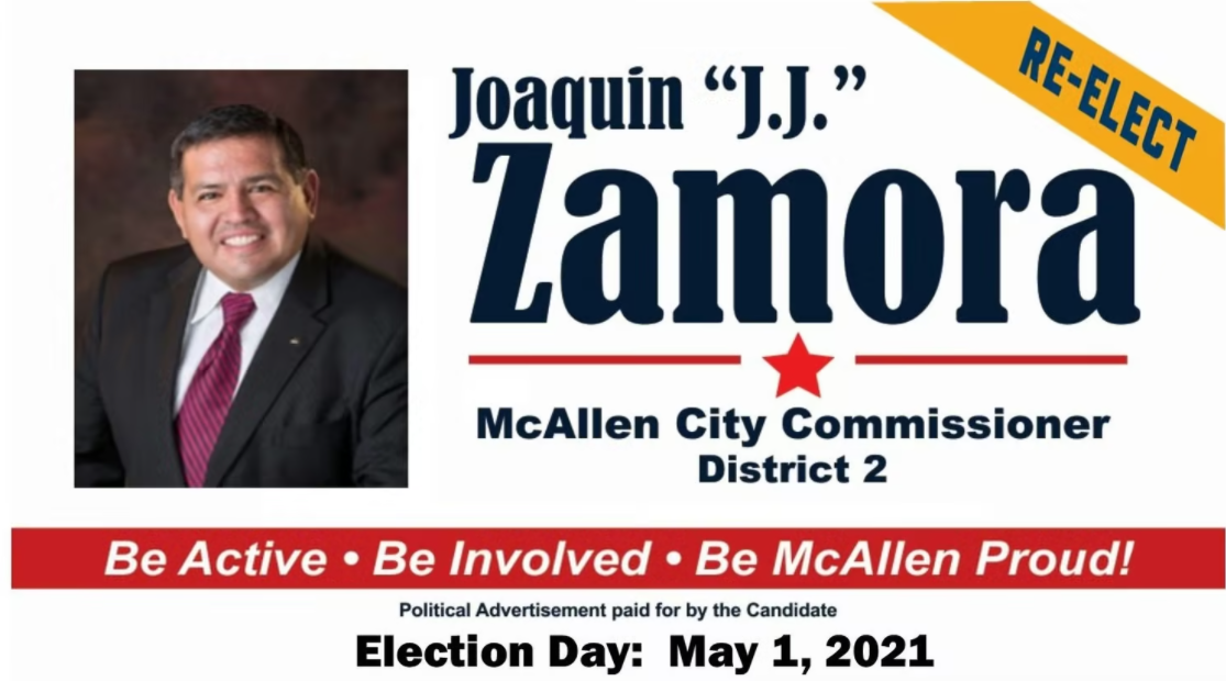
Rating: 3.1/10
Zamora’s sign looks exactly like the sign of someone who is running unopposed; low effort. This sign looks straight out of a free template on Microsoft Word that got worse once they started messing with it. Just bad.
—
District 3
Candidate: Julian Omar Quintanilla
Campaign Sign
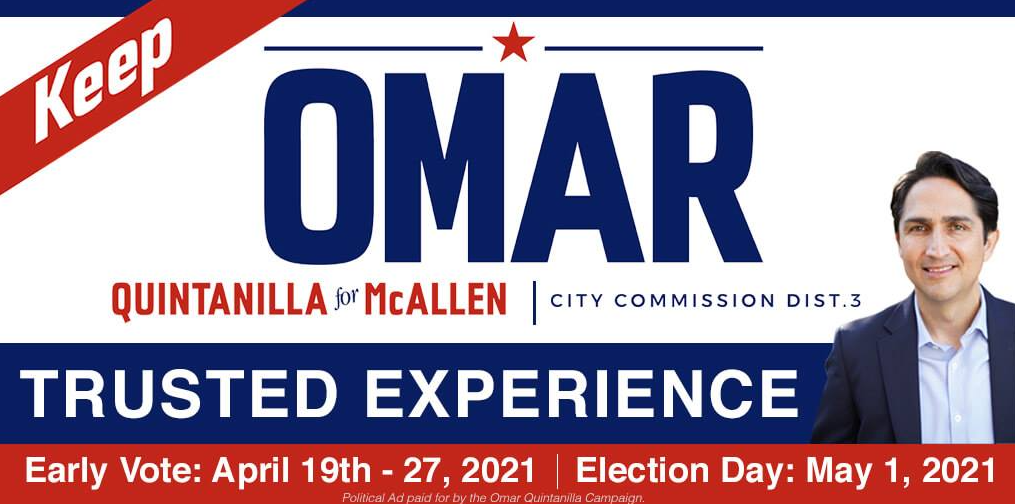
Rating: 4.9/10
Ok…what am I even supposed to looking at? This sign is a God damn word salad with zero focus. The logo symmetry is sacrificed so that they can include TRUSTED EXPERIENCE for some reason and the “keep” on the top left is literally a subtraction by addition. I need an Excedrin just looking at this sign.
—
Candidate: Thelma E. Tamez
Campaign Sign
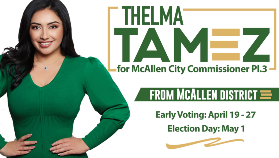
Rating: 8.1/10
The logo is uniquely modern that hints at McAllen’s own 3-bar logo. The color scheme contrast is subtle but effective with the green dress popping against the gold of her own logo. There are some issues with spacing, but overall it’s one of the better designs of the election cycle.
—
Candidate: Mario Reyna
Campaign Sign
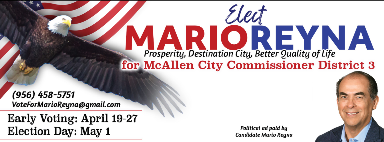
Rating: 5.3/10
Oh my, where to start. I mean, the eagle is a little over-the-top and pushes this sign into “cheese” territory. Compared to the size of his profile pic, it looks like the eagle is running for office; His profile would have been so much better where the eagle currently is and this sign would have been SO much better. Color scheme and getting the right red and blue combo can be tricky, but that’s about the only good thing about this sign.
—
District 6
Candidate: Jose Pepe Cabeza De Vaca
Campaign Sign
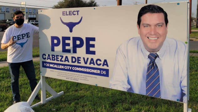
Rating: 7.9/10
I’m here for that “cabeza de vaca” logo. Great decision to incorporate a logo with his last name to create a unique identifier for the campaign. The overall design of both the full campaign logo and the sign is subtle and symmetrical with a soft color scheme that works really well. Another well-executed design.
Candidate: Larry Esparza
Campaign Sign
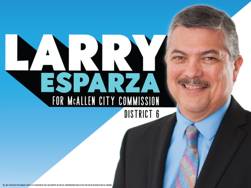
Rating: 7.0/10
The logo drop shadow/emboss isn’t a design you see that often today and in this situation, it does an excellent job providing a framework for the rest of the design. If there could have been a way to fit in “District 6” or remove it altogether, the logo would have looked that much better. The background cut diagonally to at the opposite angle as the logo was also a subtle, but effective design touch. Even though most people shouldn’t be caught dead with that paisley, gradient-striped tie, the colors actually complement the logo and background really well.
—
Candidate: Andres Fernando Salinas
Campaign Sign

Rating: 3.8/10
I’m not sure who style this guy before he decided to take this photo, but they need to be fired yesterday. First of all, what is that vest and why is it so shiny and why does it have lapels? Is that a tuxedo vest? Why are you wearing a tuxedo vest? Why is his tie so messed up? Why didn’t this guy just wear a jacket? Why does he look like he’s every server at every wedding I’ve ever been to? Fernando…why?
Candidate: Andrew Perez
Campaign Sign
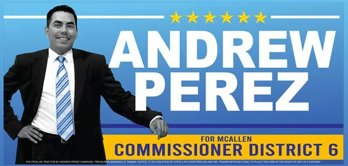
Rating: 4.7/10
Did the printer run out of human ink? I don’t understand why this guy is blue. He looks like Dr. Manhattan decided to run for local office. (Ok, let me do another) He looks like he’s running to be the next member of the Blue Man Group. What makes it worse is the yellow text box REALLY makes his blue skin pop even more than it should.
—
Candidate: Mayra Gutierrez
Campaign Sign: None?
Rating: 0/10
I combed all through Facebook and the internet to find any sign to use for my review and came up empty. We did, however, stumble across this:
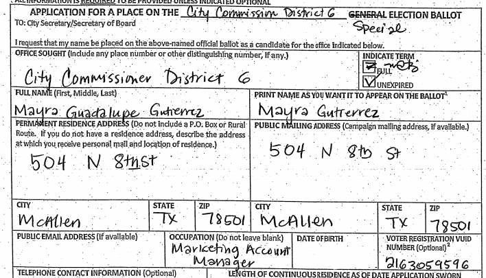
So, I suppose this person IS running. Ironically, she listed “Marketing Account Manager” as her occupation while running a campaign with virtually no marketing.
Election Day is May 1.